
Bio-Rad Laboratories, founded in 1952, is a $2.2 billion global company with various divisions serving the clinical diagnostics and medical research fields. The Quality Systems Division, based in Irvine, CA, manufactures quality controls—materials with known quantities of various elements that can be run through sophisticated clinical diagnostics instruments to ensure that patient tests are accurate.
In addition to the quality controls, Bio-Rad’s QSD division also offers software that tracks the statistical data for these QC tests over time to help improve the accuracy of these instruments, which can cost millions of dollars.
The main informatics software program, Unity, has been around for about 30 years, and has had diverse features bolted onto it over the decades. It is a thick client installed on customer servers and updated with service packs. In recent years various attempts were made to convert Unity to a web-based program, but none of the versions that resulted offered the full functionality world-class laboratories expect.
Finally the company made a strategic decision to invest heavily in a totally re-envisioned Unity that would be a modern SaaS application. It would be marketed as Unity Next.
Initial analysis
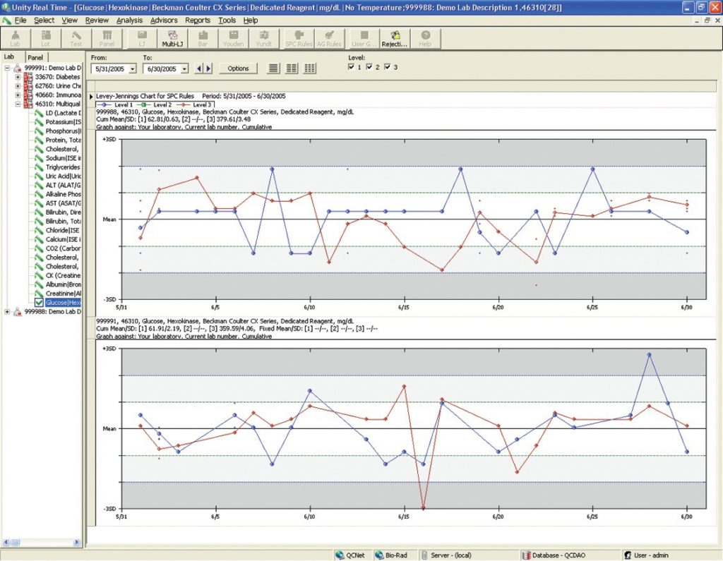
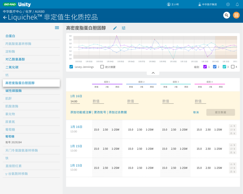
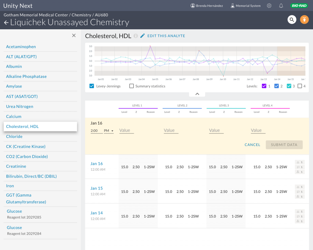
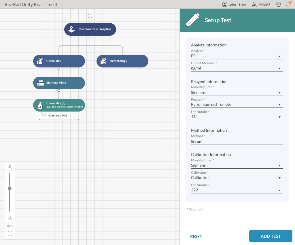
When I arrived at Bio-Rad, substantial work had been accomplished in redesigning workflows from siloed bolt-on features to unified views. For example, the basic data screen had already been merged with the Levey-Jennings chart (the two legacy screens shown above) as laboratory technicians and supervisors typically need to see them together to troubleshoot problems.
I immediately began interviewing internal stakeholders and conducting user testing to evaluate the progress to date. While the reaction to the new UI was overwhelmingly positive, there were a number of issues to be addressed:
- The navigation was siloed. Due to the way decisions were made as to which features would be built out first, basic functionality existed in islands, each with its own navigation, without reference to the rest of the application.There was no global navigation; as a fix the dashboard concept had been appropriated to provide a list of links to the various parts of the application.
- The local navigation that did exist was too deep. By encompassing the entire scope of data tables, for example, it required the user to repeatedly drill down for the most common workflows.
- The lab setup was designed to set up one element at a time. For example, if the user was to configure an instrument with tests, each test had to be added individually, But some BioRad controls had up to 80 possible tests, which means the user would have to repeat a setup 80 times. Imagine an enterprise user with dozens of machines; the setup would take an enormous amount of time.
- Similarly, the lab setup had been envisioned as a tree with cascading nodes from department to instrument to control to test. This worked very well for small labs, but any lab that had more than three or four instruments had to drag the screen around to find an instrument. Clearly this would be tedious for enterprise users.
- Some affordances were confusing, based on observing users interacting with them.
- Users often encountered hidden forms that they had to click on to perform basic daily tasks. Why were they hidden if we knew people were going to use them?
- Similar elements were handled in dissimilar ways. For example, detail panes could slide from the bottom, the right, or be a popup.
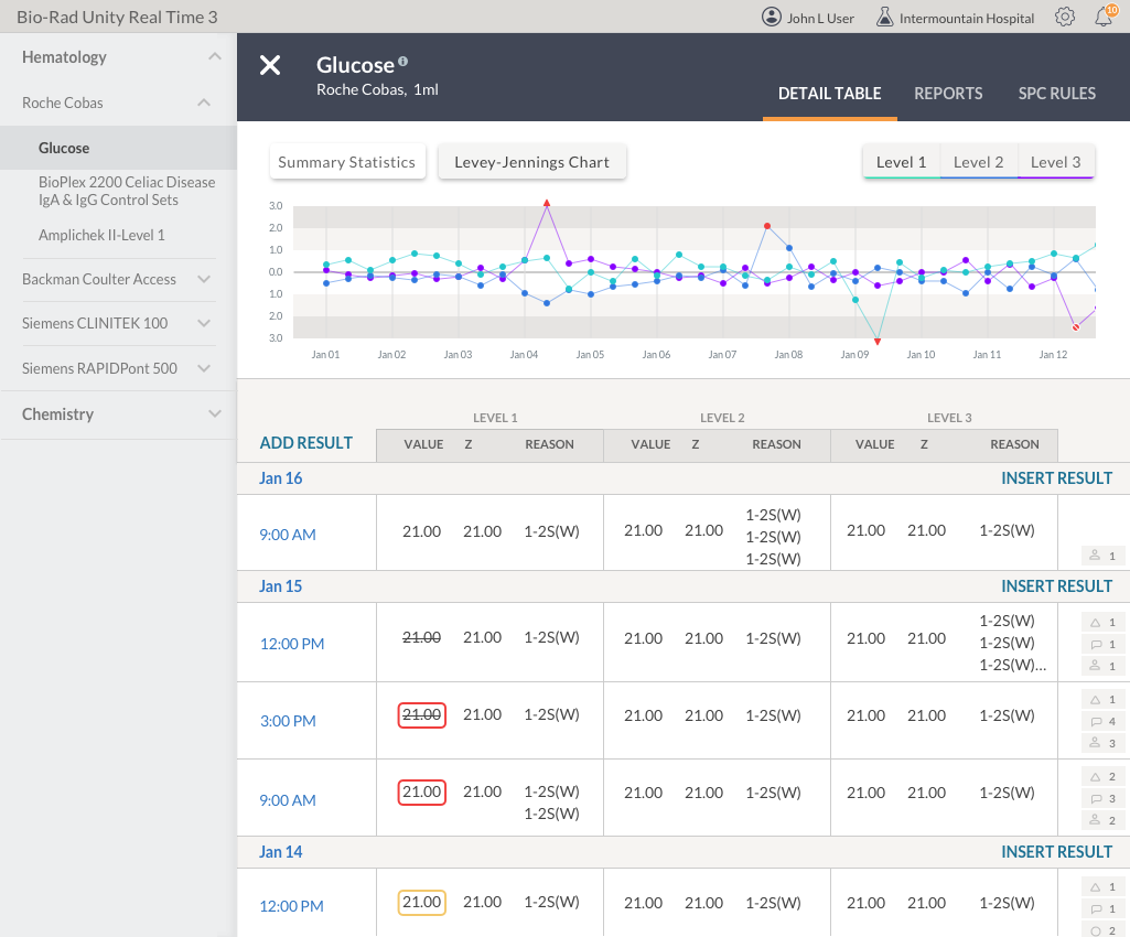
First I reworked some elements of the all-important data table/LJ screen. Buttons which were confusing to users on how to change data views were changed to more conventional checkboxes. Table borders were reduced to improve readability. The colors assigned to levels were more completely tied together to the various places level data were shown. The data entry form was open by default and ready to be used rather than being in a modal.
The redesign was then tested by users. A number of adjustments resulted, such as how to get to settings and some wording about other options for data entry.
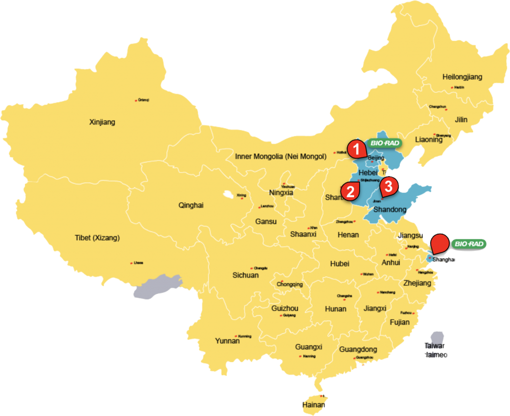
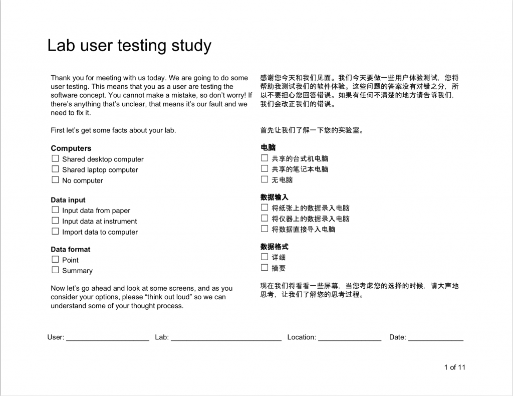
I conducted comprehensive user testing in China. We visited six hospital labs in Beijing, Hebei and Shandong provinces.
After the trip a report was presented to marketing and software development teams to explain the findings.
A new global information architecture was designed to flatten the menu on any given screen and allow smoother workflows for the lab technicians without having to navigate to multiple places to complete the day’s tasks. The navigation tested well.

Enabling enterprise
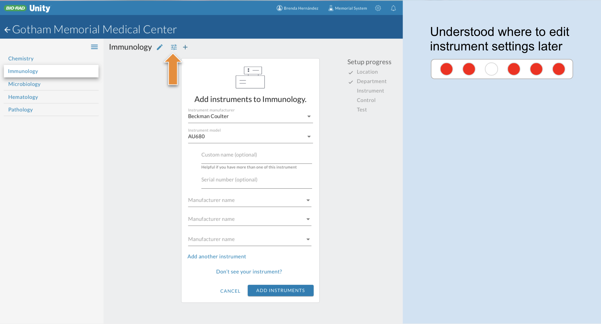
Next was the lab setup. As I mentioned, it was quite nice for a small lab but unwieldy for a large lab due to its visual representation of the lab hierarchy of department ➞ instrument ➞ control ➞ analyte. Larger labs needed to be able to set up multiple instruments at once, and batch configure analytes, up to dozens at a time. At each step, in fact, users had to select options from dropdowns, often when there was only one option that would work. Users often had to make up categories to fit the hierarchical structure. For example, a lab with 2 or three instruments that had no departments had to make up a “department” in order to add instruments under it. Users would then have to select that fake department every time just to get to the instruments assigned to it.

As nice as it was, the visual tree interface had to go. It was making the user work too much. I replaced it with simple dropdowns so multiple instruments could be added at once.
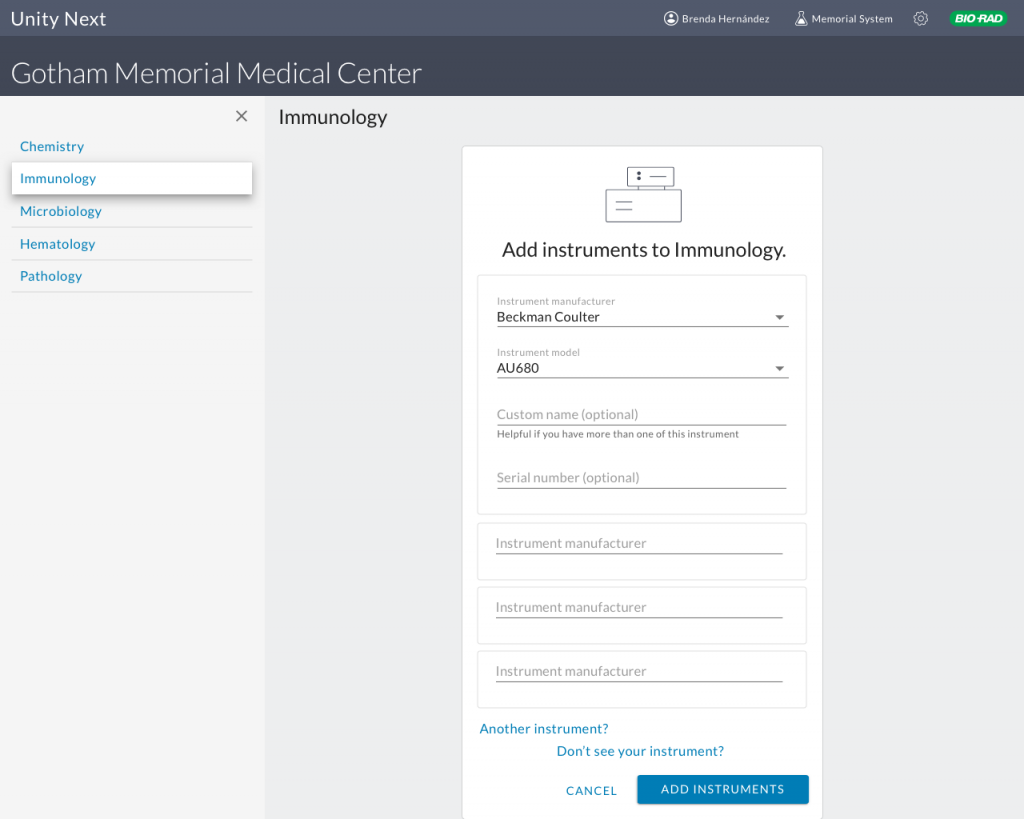
Then instead of adding analytes one by one, a new interface allowed the user to simply check which analytes she wanted to use. Through a system of cascading defaults set at the beginning of the lab setup process, the number of affordances the user had to interact with was decreased by 40%.
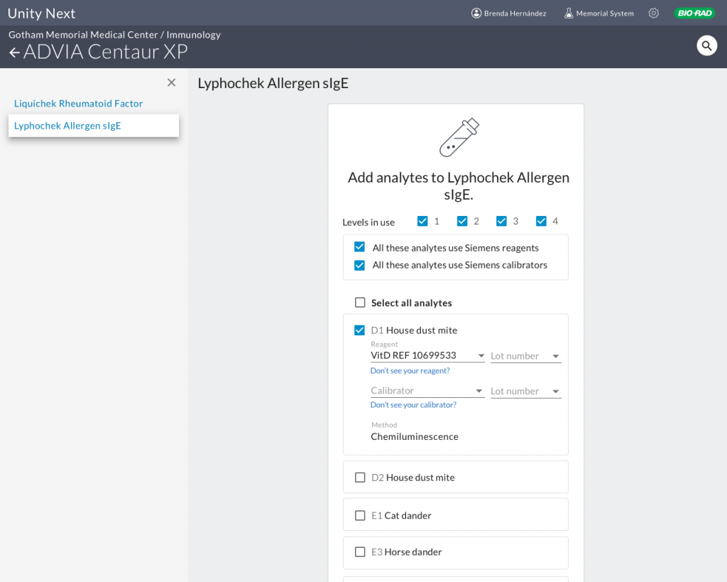
If we know what configurations are commonly used, why make the user select them? Provide them as defaults and let users handle the exceptions.

Organizing user settings
A new setting panel accessed from the level of instrument, control or analyte allowed fine-tuning of default options without having to navigate to a separate section.
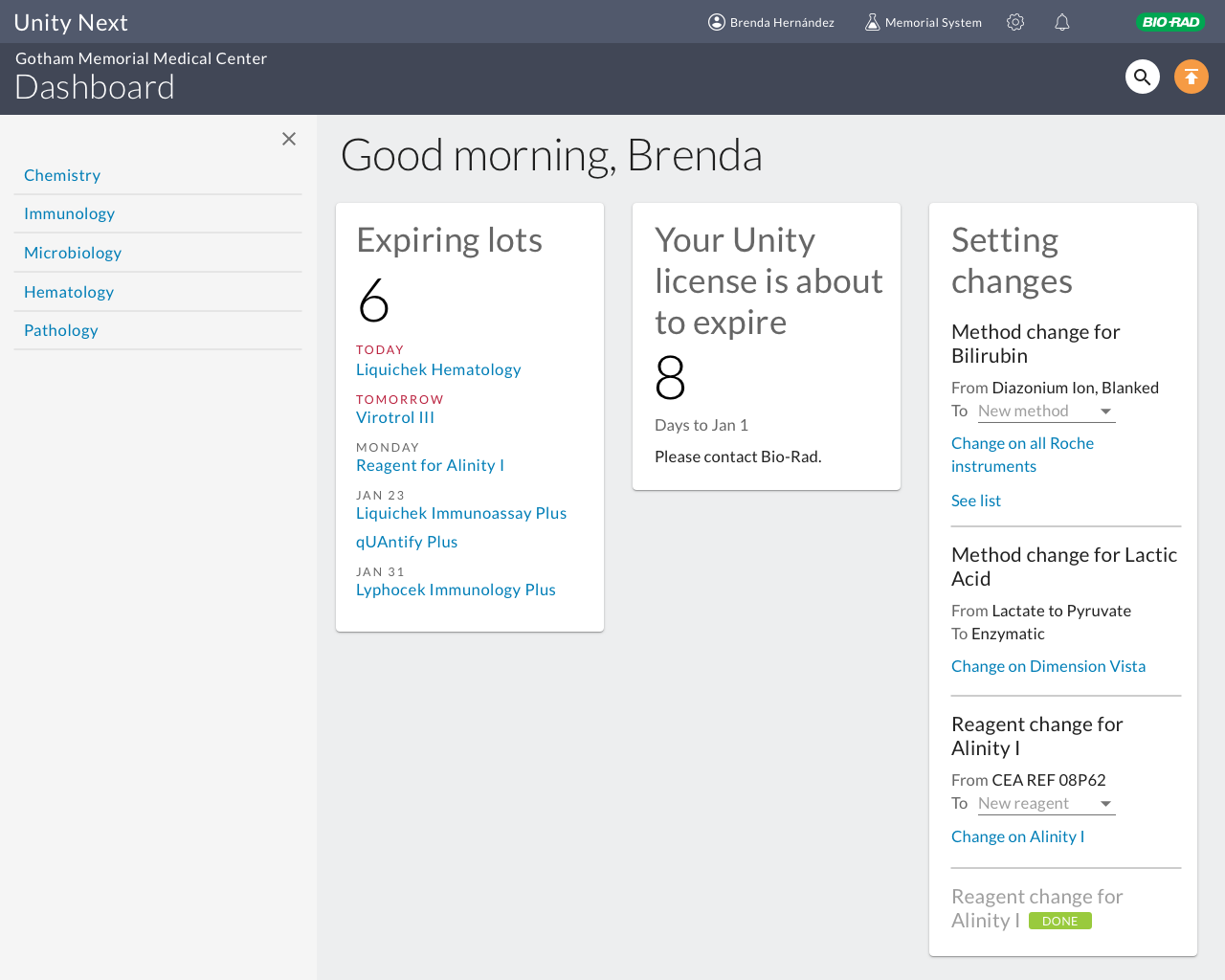
An action-based dashboard
With a new global navigation in system, we could return the dashboard to its original vision, as a landing page with the day’s tasks displayed. To determine the initial set of functionality, I conducted a workshop with the relevant product managers, resulting in a matrix of possible features arranged around axes of high/low importance and high/low development effort.
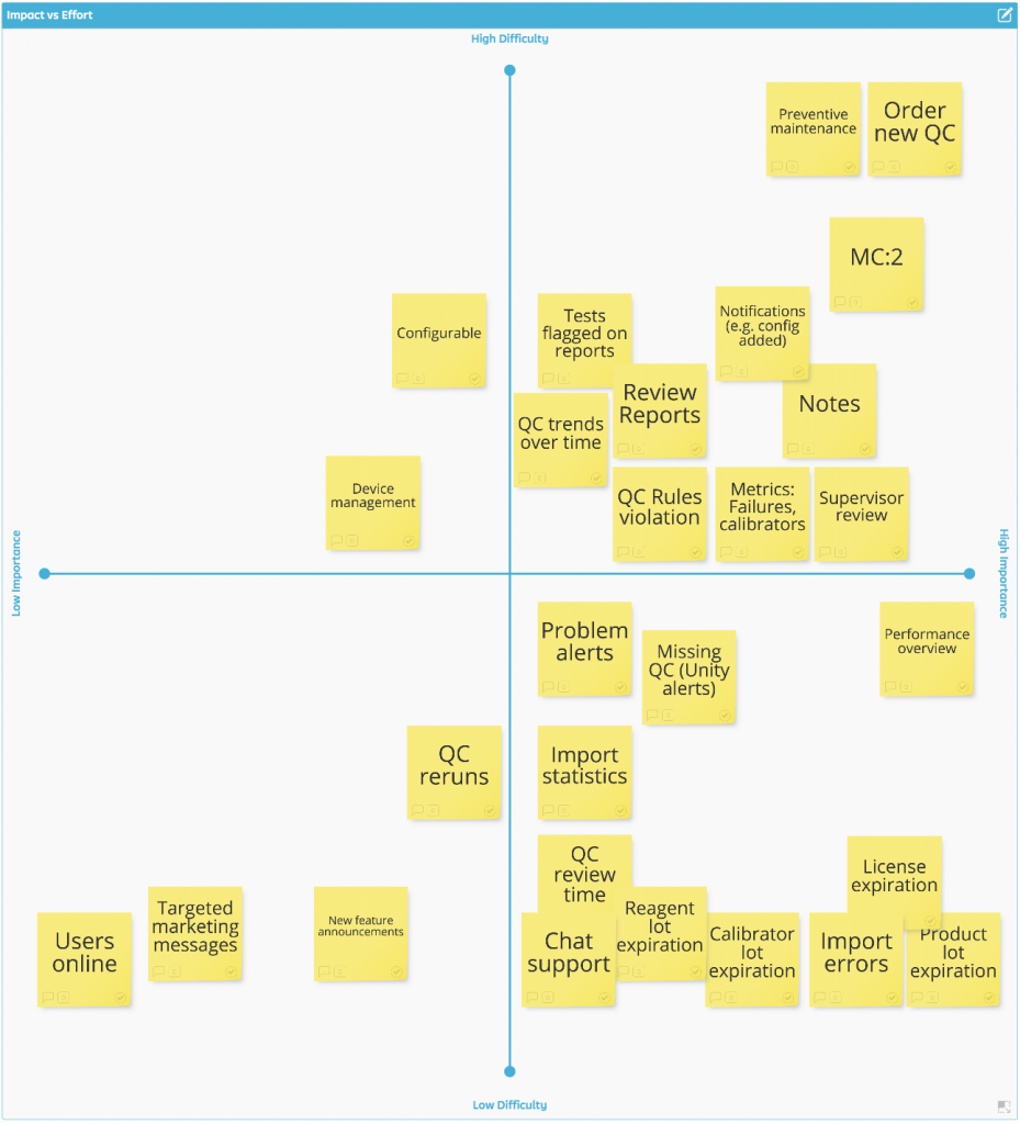
Three easy wins were identified in the lower right quadrant, and these became the first tiles on our actionable dashboard.
Translating new features from the legacy application
As the basic structure and workflows of the new SaaS Unity Next application were built out, the time came to begin to translate the sophisticated functionality of the legacy Unity desktop application to the new software.
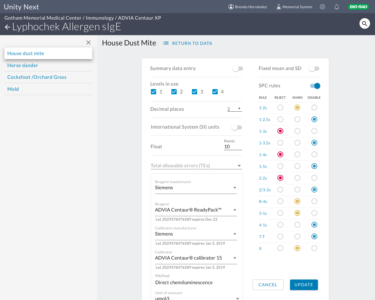
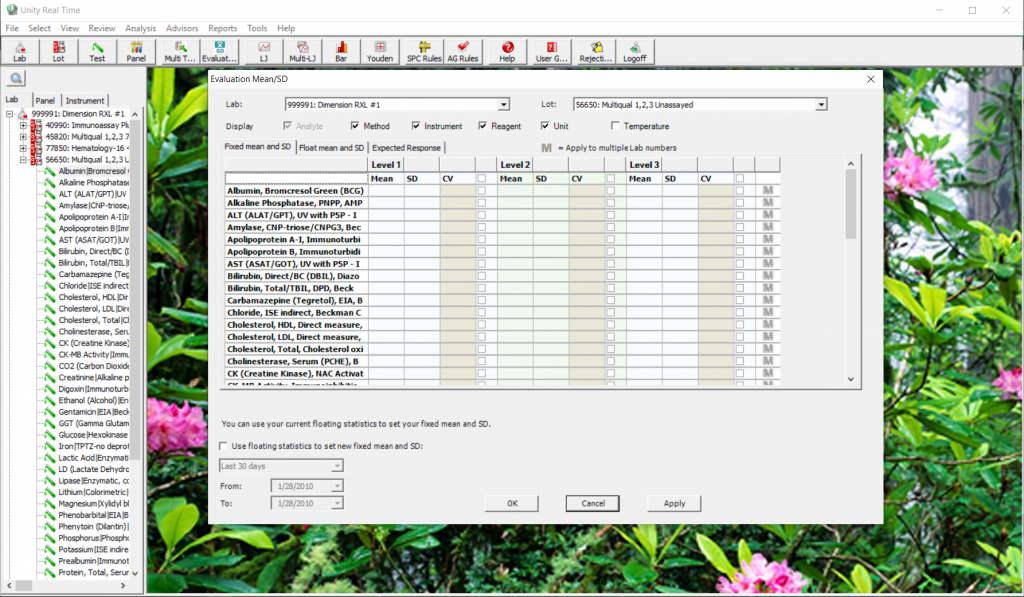
One of the first features to be brought over was the ability for lab supervisors to tweak the statistical mean and standard deviation of their goal ranges for test data. This was an example of how the legacy application had functionality bolted on over the decades; users had to go to a different section and navigate down to the analyte they wanted to adjust rather than being able to make adjustments from their data table.
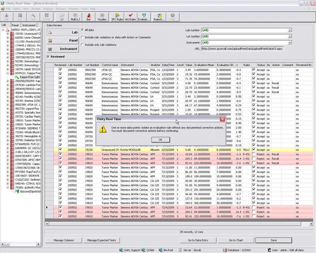
The legacy application offered this interface to adjust the mean and standard deviation:
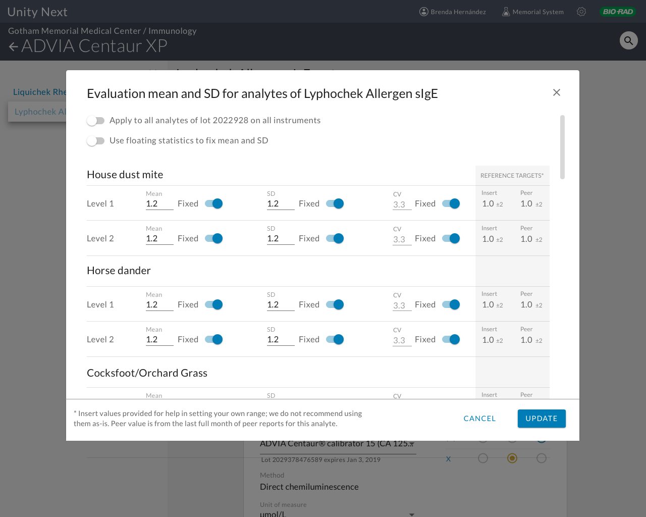
A simpler interface also included frequently-requested reference values derived from Bio-Rad product information and the most recent peer values from users participating around the world to help users determine their fixed values. User testing of bench review was conducted in Australia and resulted in some minor changes. Overall, users were excited to see peer and product values available in this interface; to date they had to either call customer service or go to a website and download a file to get these reference values. User testing in Australia uncovered some minor pain points, but by and large users were very pleased to be able to plainly see target values the currently require a tedious process of multiple sites and logins or even phone calls to review.
By including reference values in the interface, calls to customer service are expected to fall by a measurable percentage.
The next feature brought over from the legacy application was the bench review, a first-stage workflow for review of the day’s statistics that allows for troubleshooting for any significant outliers. A cumbersome interface with multiple hidden panels and tabs was simplified to allow quick scanning and annotations.
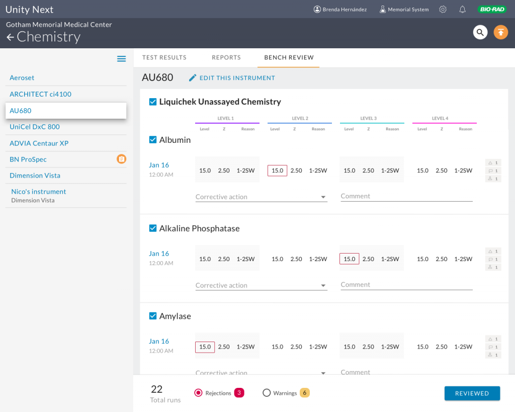
User testing conducted in Australia uncovered some necessary changes. I had designed the UI to test the assumption that users would only like to see test runs that they needed to act on, i.e., rejections and warnings.
Users however did tell us they would like to see those that passed as well. When we probed why, they said they needed to make sure all runs were completed. So this told me they need some sort of indicator of expected runs v. runs completed to find any incomplete results.
In addition, the LJ chart was included in a run detail with the hypothesis that is how the user workflow would proceed. In reality users want to see the LJ chart for an analyte overall, not just for a single run. Of course this makes sense. This is why they had difficulty finding the detail; I had placed it on the run level (which tested fine in other situations), but that’s not where the mental model is oriented.
Research tied to the product roadmap
Additional research was planned throughout the year to correspond to the product roadmap, and a detailed document was drawn up to guide planning, indicating study methodologies, tester profiles and key questions to answer for each planned new feature or enhancement. The plan is available below.
Image: Unsplash, Glenn Carstens Peters