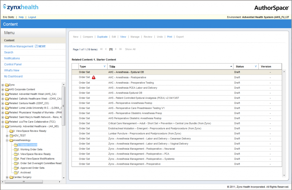
Zynx Health, a division of the $11.4 billion Hearst Corporation, made its mark in the healthcare information technology (HITech) field by providing outstanding content in the area of order sets. These order sets, which are basically checklists for physicians on what to do in the case of specific conditions or diseases based on the latest and greatest peer-reviewed evidence, are managed in the Zynx application AuthorSpace and imported into electronic health records (EHRs or EMRs).
The user of AuthorSpace was typically a hospital informaticist, and the buyer was generally the CMIO of a hospital network. AuthorSpace is a CMS that allows for extensive customization of content on a taxonomical level (e.g., “In our hospital we will always refer to acetaminophen as “Tylenol”) and collaboration on updates to the gold-standard Zynx order sets to conform to hospital policy generally set by the chief medical officer.
When I began working on AuthorSpace, Zynx had recently made a significant investment in becoming an Agile company, with the view to modernizing AuthorSpace.
The application was very siloed, as it had been added to over the years, and the interface was cumbersome, with nearly every input requiring opening a modal, then closing the modal and confirming the action. Users complained about this constantly. Targets were all very small and required precision from the user in mouse operation, for example the tiny plus sign required to open a folder tree in a Windows 95-style navigation system. The font was tiny and we constantly observed users leaning into the monitor and squinting to complete tasks.
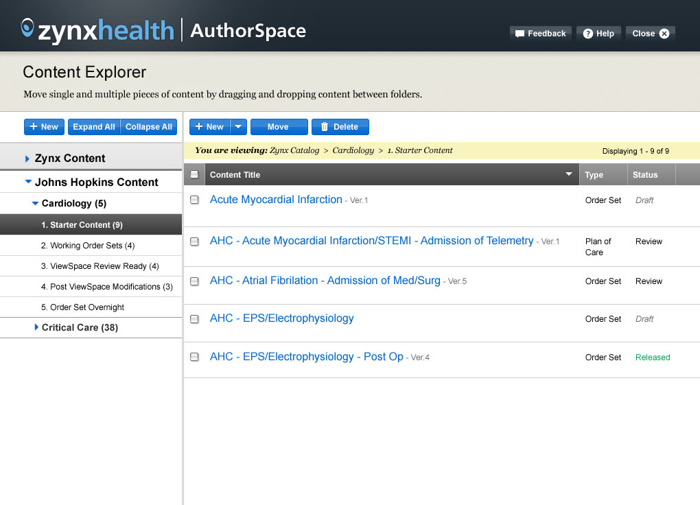
The initial redesign of the Content Explorer, the central interface of the CMS, had the following goals:
- Increase readability
- Reduce the number of clicks and buttons required to complete any task
- Reduce the number of modals and confirmation modals
- Reduce UI clutter
- Increase size of clickable targets to reduce user fatigue
- Introduce buttons to indicate actions rather than links
- Provide instructions for users to understand how to complete tasks and reduce training overhead
The redesign of the basic Content Explorer section was followed by redesigning of the workflow, collaboration and other features of the application.
Testing was undertaken among users of the AuthorSpace application at an annual conference attended by informaticists. More than 20 users were observed in task completion using a clickable HTML prototype. The research largely validated the approach, including showing that users could identify folders without a Windows 95-style folder tree! That was actually a concern of some stakeholders. A number of changes were proposed for pain points identified during testing.
Image: Unsplash, Wonderlane