Dashboards are a common feature of many applications, especially enterprise software. They fill a need so common that people often try to met this need in other ways than actual software, such as calling an Excel spreadsheet a dashboard.
A dashboard can fulfill a variety of different purposes, and sometimes more than on at a time:
- Analysis. The user needs to see real-time information to monitor external trends and make decisions based on synthesizing a large amount of data.
- Advise. The user needs to see the status of internal systems or processes to track progress and deadlines.
- Action. The user needs to be alerted to tasks she needs to do within or without the software application.
Not every application needs a dashboard. Some have a pretty straightforward workflow. But we should be open to the possibility that a dashboard is needed even if no one ever asked for it.
At FastPay, our flagship application was a client portal where clients would submit funding requests and track the progress of their requests. The application was designed to bring the client to a pipeline page on login, because the understanding was that was where most users would spend their time. In fact, even visits with clients supported this theory. But on some level, those visits and interviews were possibly biased, because that’s not what users were doing in the portal.
After installing session replay software in the application, we discovered that more than half of users were directly by passing the pipeline immediately upon logging in. Funnel analysis showed that they were all going to the reports section. There they were using a rather cumbersome report generation interface to request a specific report covering the past few days: Which of their clients had paid their bills, so that they could expect a deposit soon in their accounts.
Why were we making them navigate somewhere and click a bunch of buttons if we knew wha they wanted? If only there were such a thing as a view where you could get real-time information on things like client payments!
Of course we call that a dashboard, and it was clear we needed one not only to supplant this report, but for a number of other features it was becoming clear were important to users.

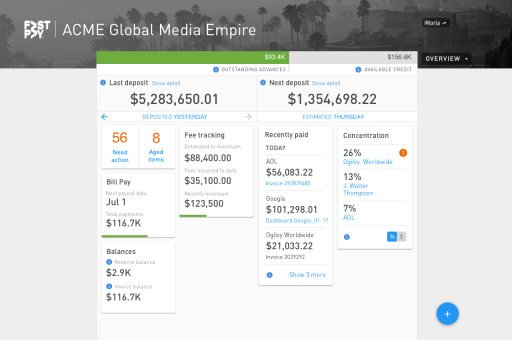
In the first version of the dashboard, the most recent deposits of the client’s advancements and upcoming advances were shown prominently. Then the paid invoices were shown, giving users immediate visibility into the main reason they were coming to the application more than half the time. Other real-time financial information that was often requested by email and phone from the operations staff was also included.

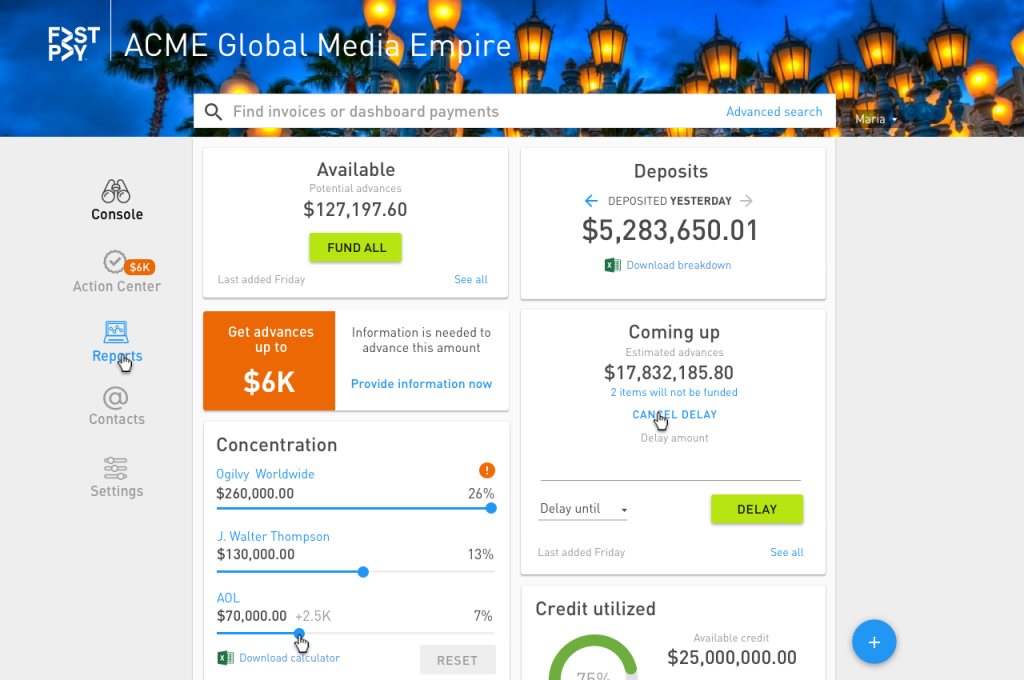
After continued testing and more interviews with customer service reps and customer visits, a second generation dashboard was designed. Aside from the fact that the company brand guidelines now allowed color, and a new global navigation scheme, the dashboard now included features that allowed the client to make decisions about funding requests, such as exploring how much funding they could request if they adjusted concentration of invoices between their customers using sliders, or if they wanted to delay funding. The amount of credit available was also given a more prominent treatment after we discovered this was a much-used feature.

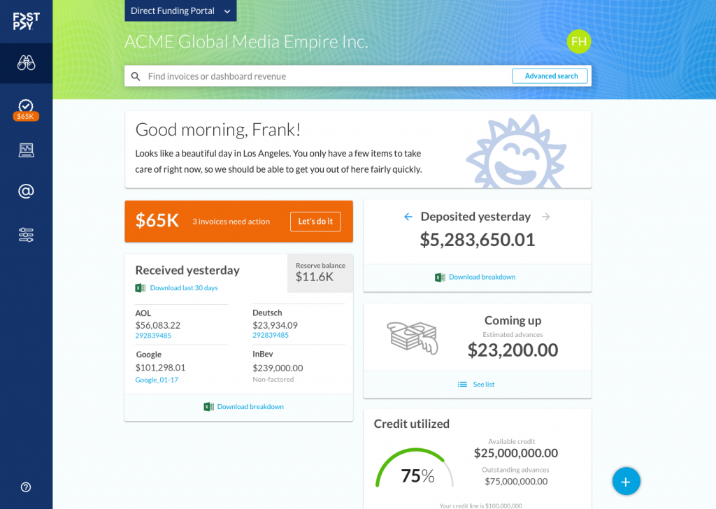
After an acquisition and further adjustments to the company branding guidelines to integrate the two companies’ styles, we also came up with a new feature called Action Center, which would allow users to batch certain processes for dozens or hundreds of invoices that they previously had to do one by one.
This new approach required some actions to be available from the dashboard as well as real-time financial information. This dashboard format would have to be adaptable to fit the needs of five other applications brought onboard by the acquisition.
Image: Unsplash, Michael Held
