When Zynx Health bought a small company with a point-of-care mobile application called Carebook, I discovered a UI in need of urgent care.
The iOS app, developed with no UX involvement, had a number of overall issues to be resolved:
- Simple tasks required multiple steps to complete.
- Users were expected to complete mathematical calculations in order to derive important patient information such as age, date of discharge, overstays, etc.
- Basic patient information such as age and sex were hidden
- Conventional UI elements had been eschewed in favor of non-standard affordances; for example, instead of a switch or checkbox the user was expected to know that pressing a box would turn an option on/off.
- Excessive customization for each hospital client resulted in delays in transferring the application to the cloud rather than maintaining it on individual client servers.
The business need was to develop an Android version of the app in the cloud. We took this opportunity to re-envision the entire interface for Android, with the intent to then redo the iOS application with enhancements developed for Android.
What follows are a few examples of how screens were iterated on to reduce cognitive load and user fatigue.
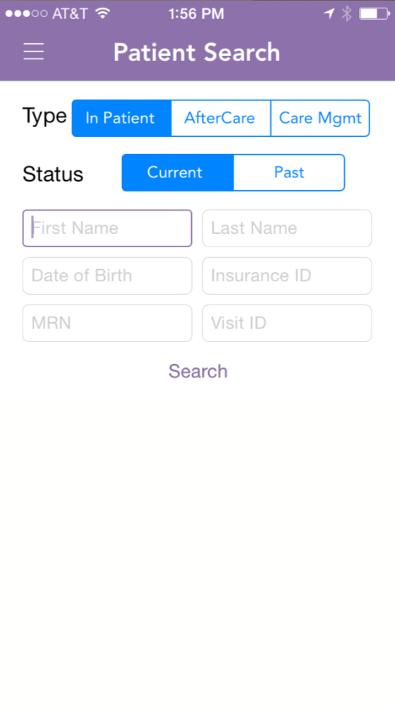
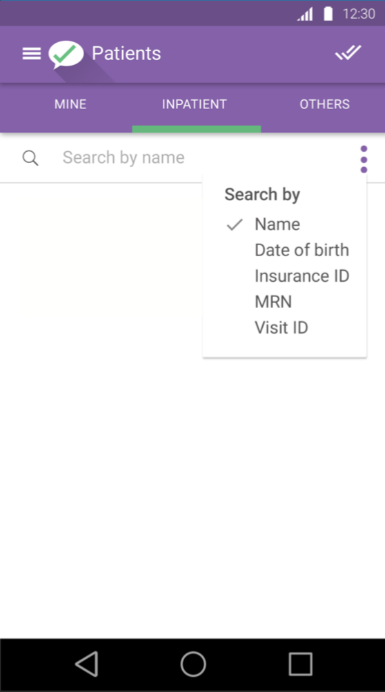
The search function was cumbersome, requiring a number of fields to be filled out—and there was no indication of which fields were required. As a result, there was an elaborate system of error messages when users did not complete required fields.
Yet it was discovered that users in the clinical setting would most frequently search by name. Other fields, such as patient number, had to be referenced from an outside source. So the initial default was changed to search by patient name, and users could choose to narrow the basic search as needed.
Note that screens below include “before” versions that are not my work.
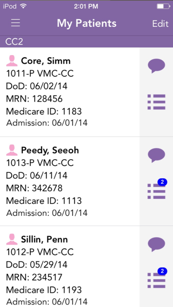
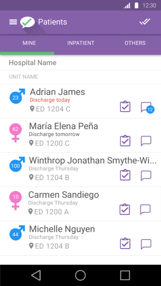
The basic starting point was a patient list based on assignments for the user that had been set by the admin user. Here again, the UI was cramped and text-heavy. Was the Medicare number something the user needed to see on a primary level, or was that referential? Did the user need to know date of admission, or was an impending discharge date more important? Abbreviations were inconsistent. All in all, it took a lot of effort to decode this list.
I strove to humanize the list, stripping it down to what was necessary for initial review, highlighting the most important information and placing details on the next level.
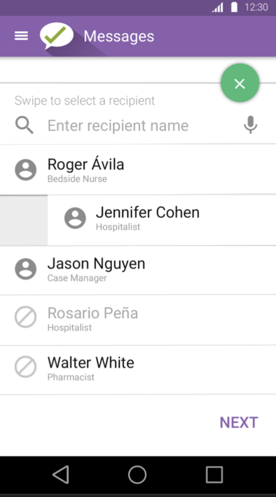
The contacts list did not provide enough room to list a typical name. The roles were small and truncated. The editing workflow was opaque and required training. Adding/deleting contacts from the user’s list for each patient was a multi-step process.
I adapted a popular interface convention of swiping right/left to add/remove a contact. Truncation was eliminated and roles were clearly indicated. Contacts who were unavailable were clearly indicated. The workflow to add a contact was clearly indicated on the screen and a voice option was provided for data entry.
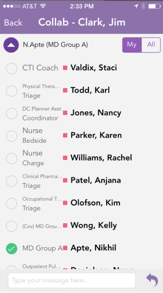
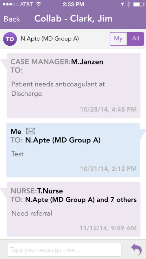
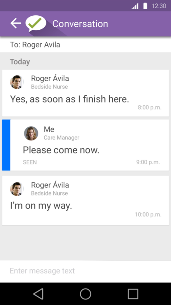
The messaging interface mixed mail metaphors with text and did not allow sufficient room to show entire name of the users. Groups were cryptically referenced. The message itself was in small, light gray text and the user name was large and bold.
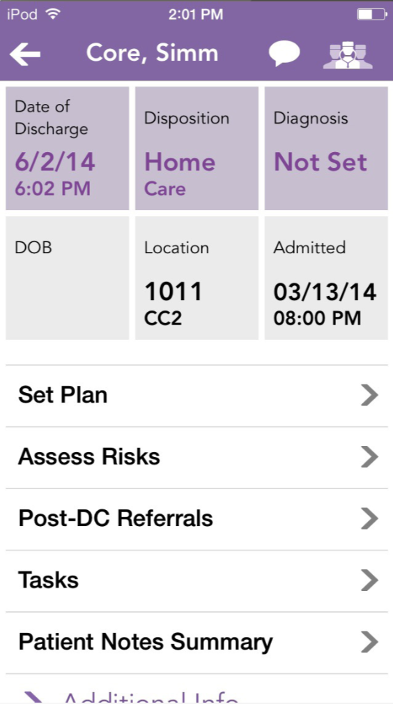
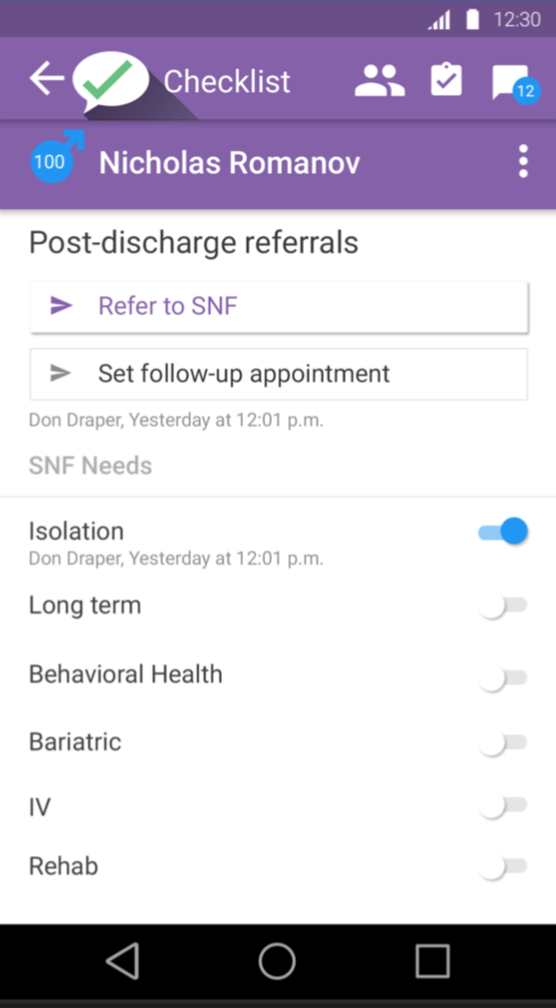
Discharge instructions were a very big part of the app. Discharge process, referrals, patient instructions and more were important workflows for patient care. The iOS app mixed affordances; sometimes you tapped on a box, sometimes you tapped on a list item, sometimes you clicked on a link. It was not clear what you might encounter given any interaction.
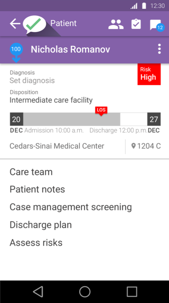
In the revised UI, the risk level was brought to the primary screen rather than being hidden two layers down. The discharge date was depicted as a destination along a continuum to indicate proximity, and if the approved length of stay was to be exceeded it was boldly displayed rather than requiring the user to refer both admission and discharge dates and then subtract. Messages concerning the patient were surfaced from the messaging functionality. Diagnosis was provided an organic space rather than a seven-character limit, which would become increasingly smaller if longer than that limit, resulting in long clinical terms in a tiny font.
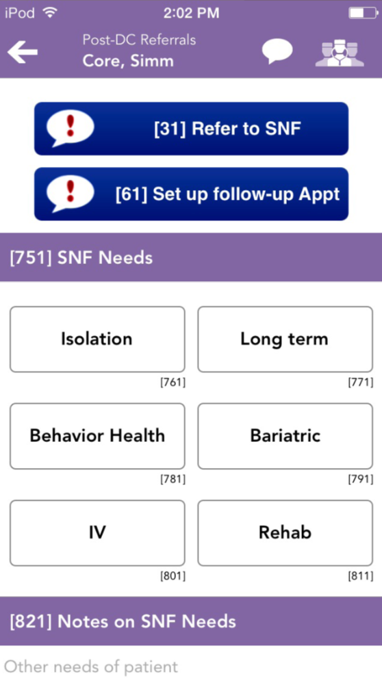
In the iOS referral screen, it was not clear that selecting an option was sending a message to another user or an external facility. Options were limited to boxes of a certain size where instructions became increasingly smaller until they were truncated.
It was clear that the new Android version had to allow more space for clinical terminology, which is often long, and to surface more options in the same space to avoid referral errors.
These are only a few of the screens that were revised. Informal testing was done concurrently with development because a large number of resources were devoted to completing the project quickly. Formal user testing would be conducted when the Android application was done, and any changes would be made to the Android interface and incorporated into the new iOS UI.
Image: Unsplash, Huish Naidoo