I live in an area with dozens of movie screens available to me within a few minutes distance. Aside from the fact that the Chinese Theater is a block away, I also have the fantastic Arclight Cinemas which is one subway stop and three blocks’ walk from me.
Arclight of course has a web site where I can select seats — all 14 theaters at their Hollywood location are reserved seating — and buy tickets. I then print out a ticket to take with me. Granted, this is a somewhat old school practice, but it’s out of habit; I only recently discovered they have an app.
The printed ticket is a good case study in user experience nonetheless. While Arclight is with the times in providing an app, other web-based services still must rely on printed materials for various reasons. It’s important to realize that the paper produced by a web site is also a part of the entire user experience and requires the same attention as the web site.
Some expectations for the printed movie ticket from the user perspective:
- Prominently display the name of the film and the time so I am reassured I got the ticket I wanted.
- Tell me which theater to go to when I arrive (there are 14 theaters at the Hollywood Arclight)
- Show me my seat assignment
From the business perspective there are also needs:
- Display date, time, location, purchase data and name of the film to assist the customer if questions arise
- Display a barcode for quick access
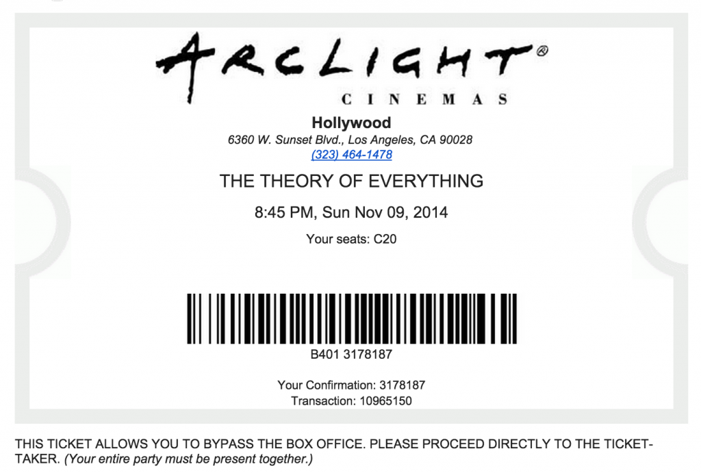
Above is the printed ticket as provided from the Arclight site. A few notes:
The ticket provides as primary information the theater address. You know what? If I am going there I probably already know where it is. The address can be provided less prominently as reference if needed, but it’s not the most important information on the ticket. Same with the telephone number. The likelihood of me needing to call the theater is extremely low.
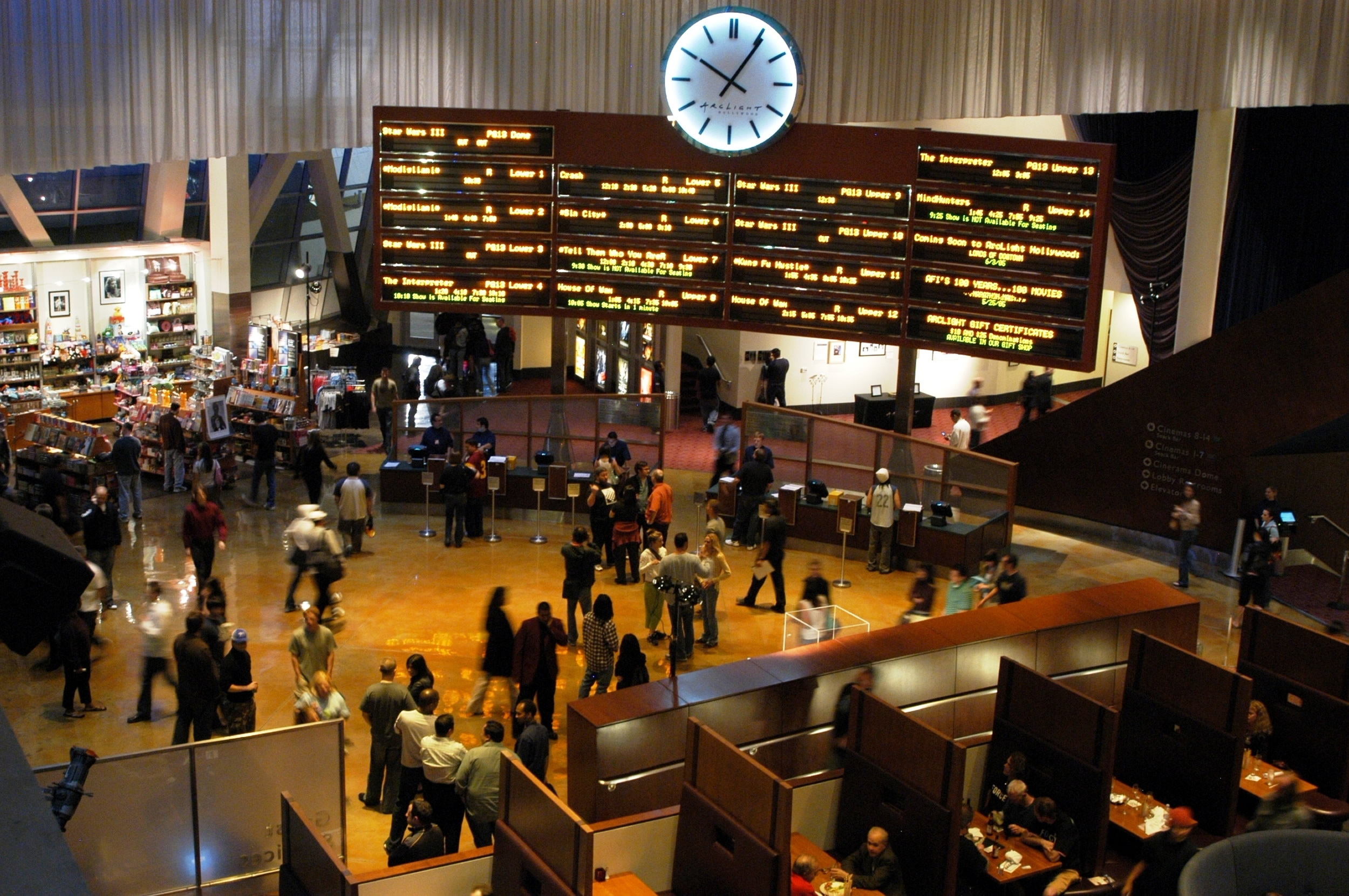
On the other hand, the first thing I need on arriving at Arclight is to know which of the 14 theaters to go to. But this information is not on the ticket! Instead, on arriving I have to stand in the lobby and check each of the 14 theaters individually to see if that’s where my film is showing. It’s like a destination board at the airport (see the photo above). Consider also that my film may be playing at three or four theaters; then I have to check all the times for each board to find my theater.
So I get the phone number but it’s my job to find the right theater.
To sum up the issues with Arclight’s current ticket:
- Infrequently used information provided prominently and clearly
- Absolutely necessary information either not provided or made nearly impossible to see
It would not be costly or difficult for Arclight to fix these usability issues. Here’s an example below.
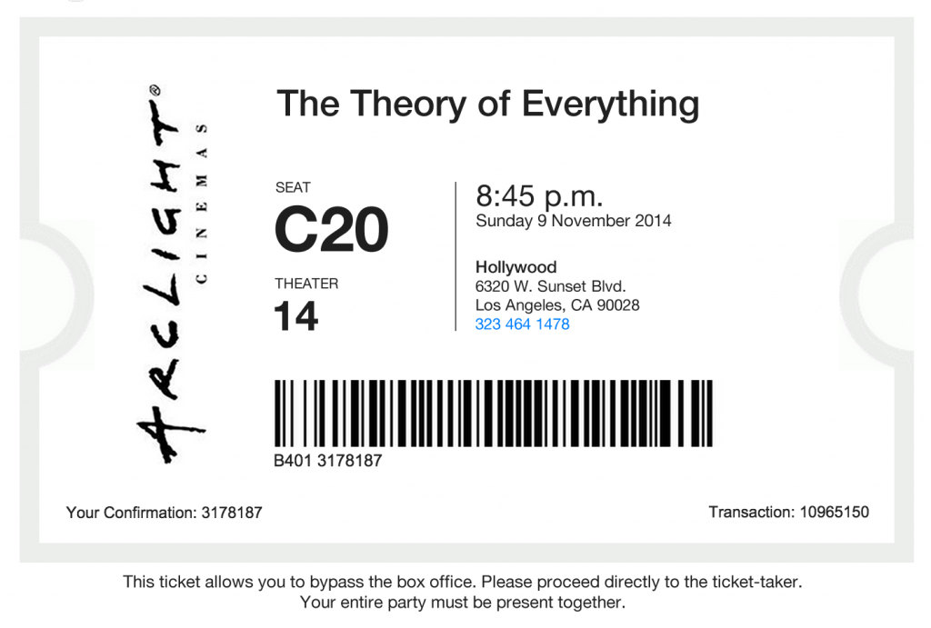
The first question is whether the retro-style ticket outline needs to be retained. Some may say it’s kitschy and clip-arty, but I have no particular problem with it; at least it certainly shouts “This is a ticket!” So let’s leave it in.
Branding. It has to be there. But does it need to be centered at the top and the largest element on the page? Probably not.
Let’s be right up front and put the title of the film at the very top. That provides clarity. Make it upper and lower case for readability; ALL CAPS is less readable. Bump up the size.
Next is the seat, the largest element. Make it huge so you can see it in the dark theater. The Theater number also needs to be there, but smaller because you’re not reading it in the dark; you’re looking at it in the lobby.
The next most prominent element is the time. I know what day I’m going (probably the same day I bought the ticket), but I may forget the time. Was it 8 or 8:15? Oh, 8:45. Helps to have that on the kitchen counter so I’m not late.
Lastly, the address in case this is the first time I’m going to this location. And the telephone number in case I’ve never heard of Google Maps and I get lost.
Did you notice that the priority of the current ticket and the user priorities were almost exactly inverted? Data was presented neatly, but without consideration of how it would be used.
The redesign of the printed ticket is a good illustration of the factors that need to be taken into account in user experience design, as well as a reminder that UX is more than UI.